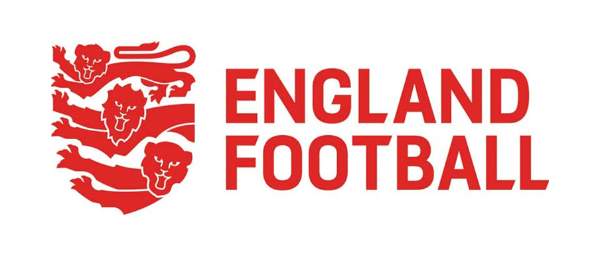
The logo for the English Football Association (The FA) has had a makeover. I like the idea behind it, but the implementation just doesn’t work for me. Personally, I think it lacks any strength and looks too scruffy, with jagged edges, as if it was designed in a 1998 copy of Microsoft Paint! And why are the lions laughing?
