Not too long ago I was invited to meet with a clothing company to discuss some fundamental improvements to their Shopify website. Disappointingly, after two hours of driving and an unproductive 10-minute meeting (where their only in-house developer didn’t show), I came away with a wasted journey.
At least it was sunny.
Recently, I came across their new website which on first impressions looks lovely. However, when you begin browsing it becomes a user experience nightmare.
There is no doubt that their new website is designed for designers, rather than their users and there are many basic UX design mistakes that have been made that I believe would be beneficial to highlight.
1. Make the navigation obvious
When you first access the site, the homepage displays a full page, beautiful and crisp product/model shot.
However, from here I was a little lost. What would I click on next? It took me a while to find the menu, search and basket icons in the top corners of the page due to them being white and blending into the large image.
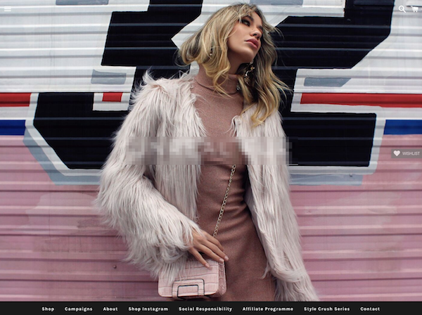
At the foot of the visible page is what seems to be the main navigation. With it being an ecommerce website, I would have assumed product categories would have made sense here? The homepage isn’t very sales driven, so with the aim of seeing some products I clicked on the Shop link.
My fix
My first change would be to highlight the icons in the corner more by adding a background to them. I would also replace the links in the main navigation with links to the product categories and move the rest into the site footer which is further down the page, or better still within the menu dropdown (the top-left icon).

2. Don’t hide essential information
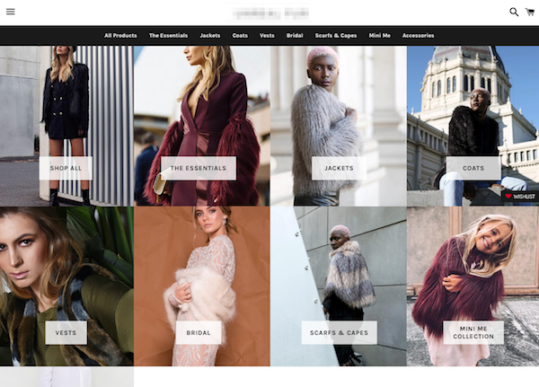
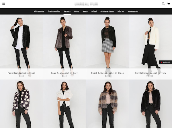
I was then presented with a grid of nine product shots, which to me could either be actual products or they could be categories.
There was nothing on this page at first glance that offered me a guide as to what to do next. Not until I hovered over one of the images was I told what I was looking at.
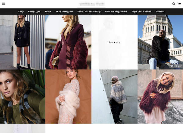
Some of the products displayed in the photos look similar to each other, so not having the category headings displayed by default means users would have to find what they are looking for (and then hope they can remember where they saw it as they continue browsing!).
My fix
To make elements evident to the user and to prevent them from searching for answers, I would display the name of the category or collection by default. The main navigation would be the same as per the changed homepage.
3. Don’t expect users to remember
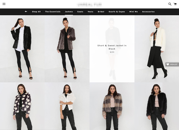
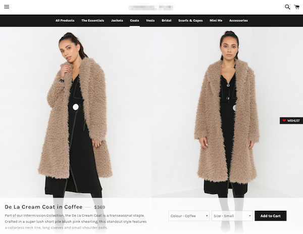
The product page is similar to the collections page in that it too hides essential information. The user must hover over the image to see the product title and price.
When hovering, the image also gets covered so the user can no longer see it when comparing products. Product grids are perfect for comparing items at a glance.
My fix
As per the collections page, I would display the product title and price as default which would allow all the product images to be visible and comparable.
4. Don’t disappoint users
The product page is one of the better page designs on this website, but there are still some improvements to be made. The user is presented with two incredibly large images of the product, which is excellent as the photography is outstanding.

The drawback here is that the product information, size guides and pricing are all lost further down the page with the important call to action, the add to cart button, also being below the fold (yes, it still matters!).
Moreover, if a product is out of stock, the user would have no indication until they scroll half way down the page.
Confusingly, the black navigation bar disappears from this page. It’s not the most intuitive site navigation, but it should remain on this page to maintain consistency.
My fix
I would bring the product title, price and add to cart button above the fold and show the first few lines of the product description. As the user continues to scroll the remaining content will be viewable.
Other improvements I’d make
- Add cross-sells to all product pages
- 360º image carousels or videos would be perfect for the product pages
- Make the home page more sales driven by displaying links to product categories, new product arrivals, special offers and social media snippets
- Add image zoom functionality
- Increase the font size of all body text to 16, so it’s much more legible
In summary
- Don’t expect users to search for essential information themselves. Make it easy for them to make an informed choice. Headings should be clearly visible.
- Make site navigation obvious and consistent. Customers are looking to buy, so don’t hide it.
- Design for your customers – not just to make your website pretty in the hope it wins an award.